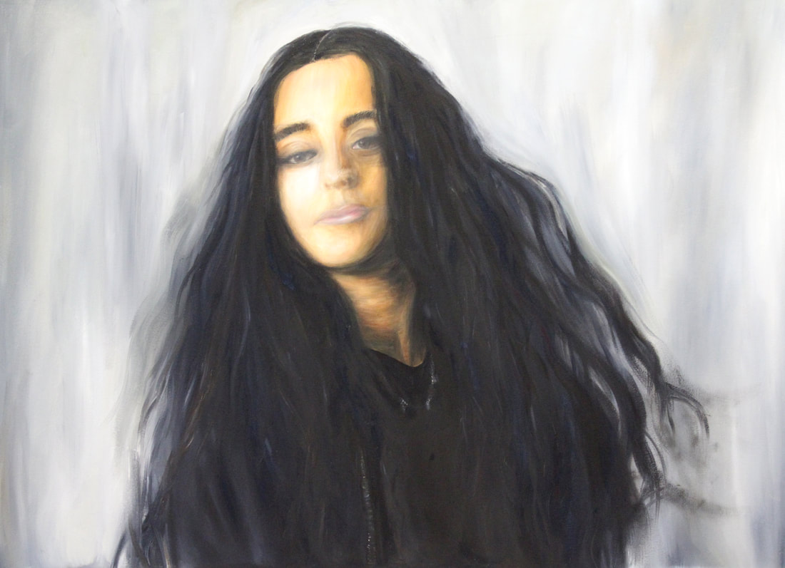
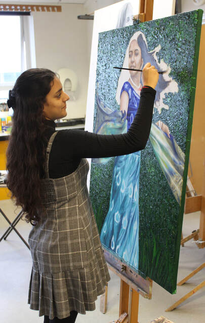
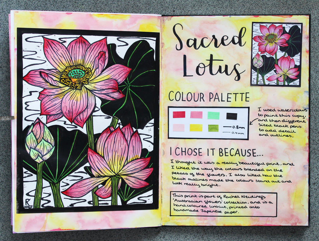
20 NOVEMBER 2023. Siona (Year 13)
|
|
|
20 OCTOBER 2020. Ian Russell
"Memory can change the shape of a room, it can change the colour of a car. And memories can be distorted. They're just an interpretation; they're not a record."
Leonard Shelby in the film Memento, directed by Christopher Nolan (2000) It seems that one of the ways lockdown affected me was to bring to the surface a lot of old memories. I gather this was happening to quite a few people. In my case, the memories I found myself dwelling on the most were the ones tied up with my time as a student. I loved being an art student (aside from a bit of homesickness in the first year of my degree). It felt, and still feels, like a brilliant period in my life. Studying art & design full-time was demanding, stimulating, exciting, stressful, confusing and thoroughly enjoyable. My journey through higher education included the following stopping-off points: Art Foundation Studies - West Sussex College of Design BA (Hons) degree in Graphic Design - Bath Academy of Art Honorary Fellowship - Bath Academy of Art Post Graduate Certificate of Education - University of London And, some years later, I did an MA in Art & Design Education as a part-time student at the University of London. As you can see, I was a student for quite a long time, so it's perhaps not surprising that I still remember it so vividly now. I particularly loved studying on the Art Foundation Course at WSCD. It was such an intensive, challenging and stimulating course. And I had the good fortune to be taught by some extremely inspiring and dedicated teachers, such as Jan Wright, Gordon Kelsey, Keith Swain, Clive Vosper and Peter Gibson (peterjdgibson.com/). Peter, who led the Foundation Course, was, as well as being a great painter, an excellent musician and a member of the band Brett Marvin and the Thunderbolts. It is partly due to Peter's influence that I developed a love of playing drums in a band. The two art institutions where I studied have both, over the intervening years, experienced major changes: they've moved house and changed their names, and they've become much bigger. Partly because the versions of these colleges that I knew no longer exist, and because I am conscious of what a slippery thing memory can be, I felt prompted to do some research into their history. I have turned some of what I found into two pieces of typographic design. Typography was one of the disciplines I studied on my degree, so it seemed an appropriate medium to use. 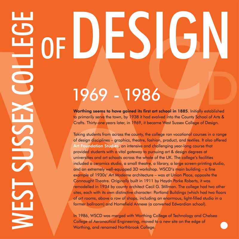
Typography by Ian Russell, using the font Futura (designed by Paul Renner).
Click on the images to see bigger versions 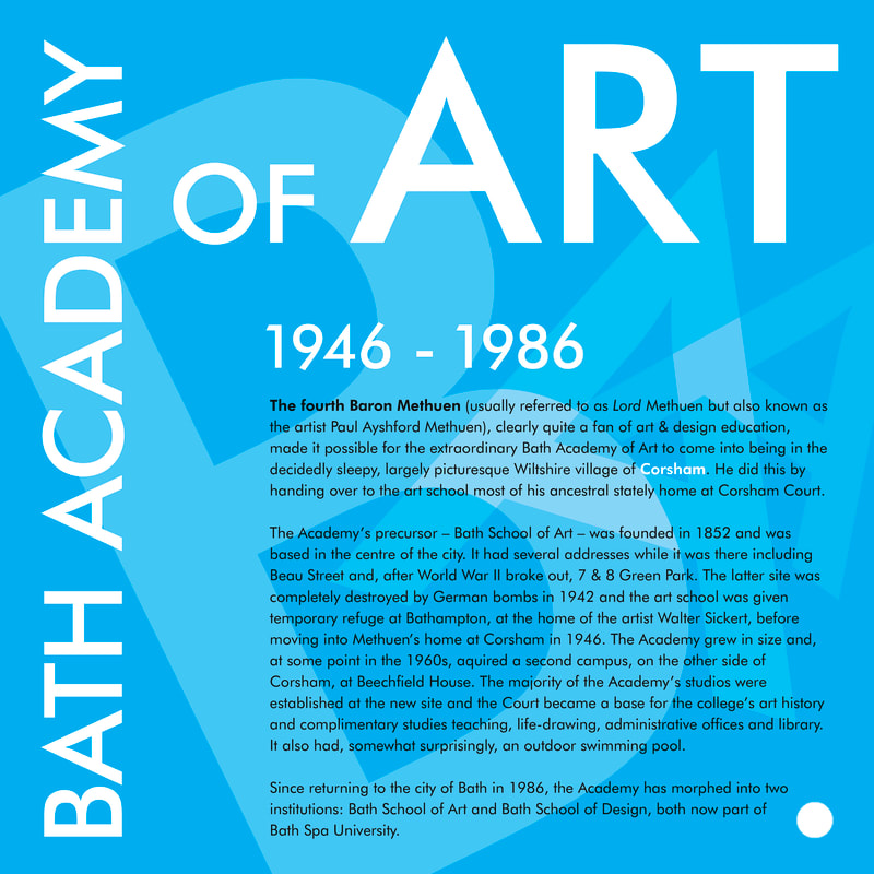
8 JULY 2020. Ian Russell
"Nothing can be accomplished without solitude; I have made a kind of solitude for myself ..."
Pablo Picasso, 1932 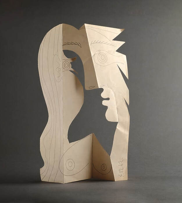
Head of a Woman (1962). Pencil on cut and folded wove paper
On 16 July (or 9 July if you’re an RA Friend) the Royal Academy will be re-opening its doors and re-starting its excellent Picasso and Paper exhibition. I was fortunate enough to see this show a few weeks before Lockdown started and (Covid-related practical problems not withstanding) I can thoroughly recommend it. It contains 300 artworks, taken from across the whole of Picasso’s 80-year career. The exhibition will be on until 2 August.
Why Picasso? Most art academics agree that Pablo Picasso was one of the most influential western artists of the twentieth century; many would call him the most influential. Not long after photography had arrived on the scene (and comfortably established itself as a very effective method of creating an accurate two-dimensional reproduction of things like people, objects and places), Picasso and his friend Georges Braque invented a way of painting that took art in a whole new direction. Their new style of painting became called Cubism. Rather than persist in trying to compete with the camera in visually recording a subject from a single viewpoint, they started making images that could really only be made by an artist wielding something like a paintbrush or a stick of charcoal. Picasso was influenced by artforms from beyond western Europe, in particular traditional African and Iberian sculpture, which seemed to be more to do with expressing the artist’s thoughts and feelings about a subject than merely showing us what the subject looked like. At a time when most of his artistic peers were still trying hard to make pictures that would fool us into thinking that we weren’t actually looking at a painting, but at a person or a landscape or a bowl of fruit, Picasso created painted images that looked like they were made from, well, paint! 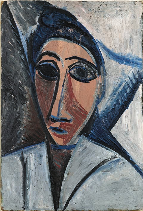
Study for Les Demoiselles d’Avignon (1907). Oil on cardboard
Crucially, Picasso and Braque also did something with Cubism that, at the time, must have seemed very weird to most people. In a single painting of a subject, such as a still-life or portrait, they started using more than one viewpoint: a side view here, say, morphing into a front view there. Picasso and Braque saw this as a way of giving the viewer a much greater sense of the artist’s understanding and experience of the subject.
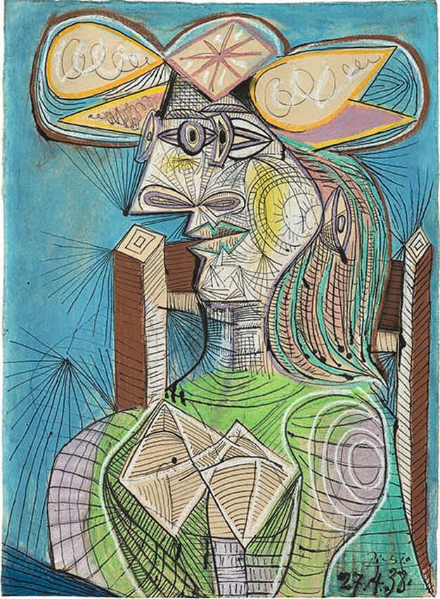
Seated Woman (1938). Ink, gouache and coloured chalk on paper
Through Cubism and his subsequent work, Picasso played a huge role in liberating western art from only being about giving us accurate reproductions of segments of our visual world. Artists have remained free to continue doing that kind of thing, of course - and most of us still appreciate the magic of seeing a face or a landscape faithfully reproduced by the hand of an artist - but artists now also have the freedom to do quite different things with their art.
Why paper? "For me, art has neither past nor future; all I have ever made was made for the present." Pablo Picasso 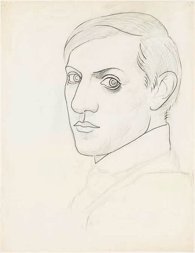
Self-portrait (1918). Pencil and charcoal on wove paper
Paper is an amazing invention! It was first developed in east Asia, probably in China, around 105 CE. It took centuries for it catch on in the west and in the course of its development it's had a number of problems, such as having a tendency, for a period in the nineteenth century, to disintegrate into dust after just a couple of years, which artists, writers and librarians must have found very upsetting!
Happily, changes in paper-making materials and technology mean that modern paper does a much better job of surviving the rigours of time than many of its antecedents, but it is still not as robust as a lot of the other surfaces (supports) that artists paint onto, such as canvas, wood and aluminium. This built-in fragility the material has makes it all the more exciting to see works on paper by an artist like Picasso. We know that a lot of these pieces won’t stay intact for that much longer; in the case of some of them, it’s a miracle they have survived this long! 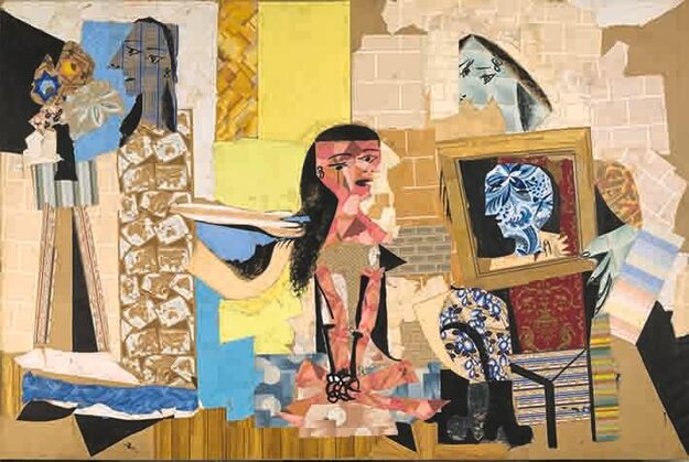
Femmes à leur toilette (1937–38). Cut-out wallpapers with gouache on paper
In common with a lot of artists, Picasso often worked on paper when he was drawing or printmaking. He also used it as a 'medium' - something to work with in his picture-making, as well as something to work on. This exhibition shines a spotlight on these other facets of his work.
Artists’ drawings are often fairly private affairs. Sketches done in a book are usually not intended to be exhibited to the public. Drawings often reveal an artist’s first thoughts, ideas and plans for a major artwork. This is the other exciting thing about Picasso and Paper – the show gives us a privileged insight into a great artist’s creative process. 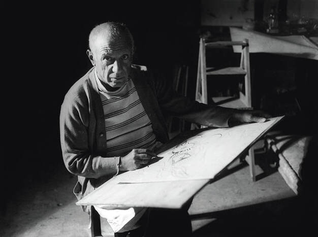
Pablo Picasso drawing in Antibes, summer 1946
26 May 2020. Ian Russell
For the last couple of months, I have been dying to write about an exhibition; something that's recently opened and which I've just seen at, say, the Royal Academy, Hayward Gallery or either of the Tates. Lockdown has, though, made that kind of thing a little tricky.
So, I have decided, instead, to focus on some artworks a little closer to home. Well, to be accurate, in my home. Here's my selection of my five favourite artworks currently taking up space on the walls and shelves of my house: 
Oil paint on canvas (1982) by Helena Giles
This is the first painting I ever bought and I still love it. The artist was a good friend of mine when we were both art students at Bath, so when I look at it now I enjoy it as an artwork and because it makes me think of my old friend and my experience of being a student.
The piece is abstract (so, not an immediately recognisable depiction of something physical) but is based on, or inspired by, elements from the artist's physical world. The vertical wavy lines and blobs of colour on the right of the composition are based on a memory of car tail lights from a long night-time journey, and the patch of blue is from a beautiful day-time sky at the journey's end. "I'm not sure how that ended up at the bottom", Helena told me. It's not unusual for artists to say such things: just as authors often express surprise at things their characters do in a novel they are writing, painters are frequently taken in unexpected directions by an artwork they are creating. 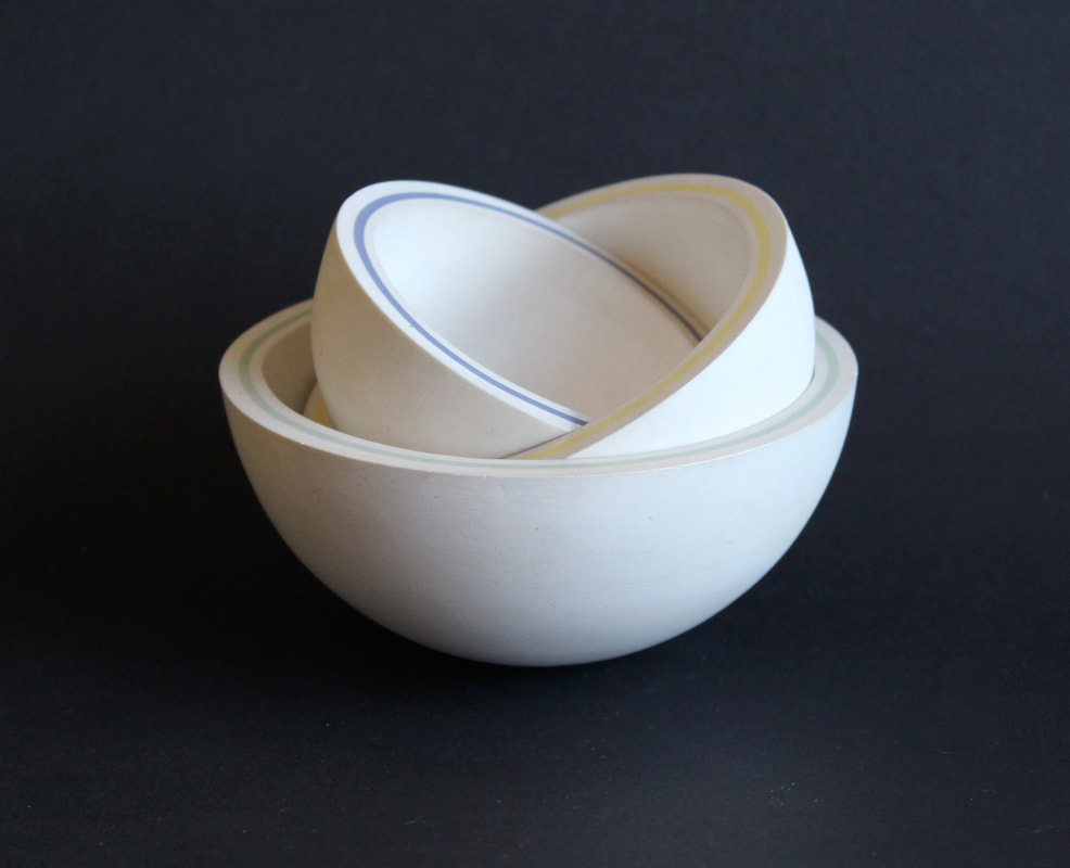
Semi-porcelain ceramic sculpture (1985) by Carol Mayo
This piece was given to me by an artist who I became friends with a couple of years after I graduated. We did a swap: I gave her one of my screen prints and she gave me this beautiful sculpture. I'm fairly sure I got the better end of the deal.
Carol made the piece when she was an art student. It was one of a series of sculptures inspired by conkers in their casings. Semi-porcelain is a difficult clay to work with: it doesn't have much elasticity so it's rather prone to crumbling and falling apart in your fingers while you are trying to make something with it. The sculpture is made up of three concentric hemispheres that fit snugly together. The side of each hemisphere is made from three layers of clay; the outer and inner layers are the natural colour of unglazed semi-porcelain, the middle layer has been coloured with a type of body-stain, mixed by the artist. So, the colour runs right the way through each piece, like the words in a stick of rock. 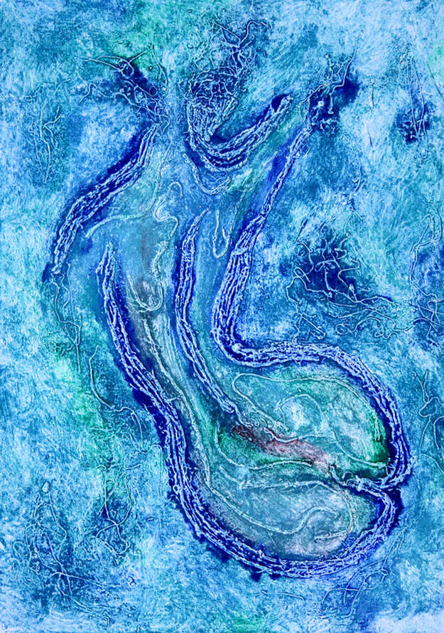
Monoprint with spirit-based ink on paper (2014) by Megan Black
Megan Black created this beautiful print when she was an A Level student at SWPS. I persuaded her to sell it to me after it had featured in her end-of-course exhibition. It is one of a series of images that she printed in different colours. I also have a version in megenta. It is a semi-abstract design based on one of Megan's life drawings from the same year.
Pretty much every year, I see artwork being created by our students that I would be quite happy to own. I usually manage to resist the urge to offer to buy them - it helps that the students are often, understandably, reluctant to part with them - as I would quickly run out of wall-space and money. Something about this piece, though, made me cave. 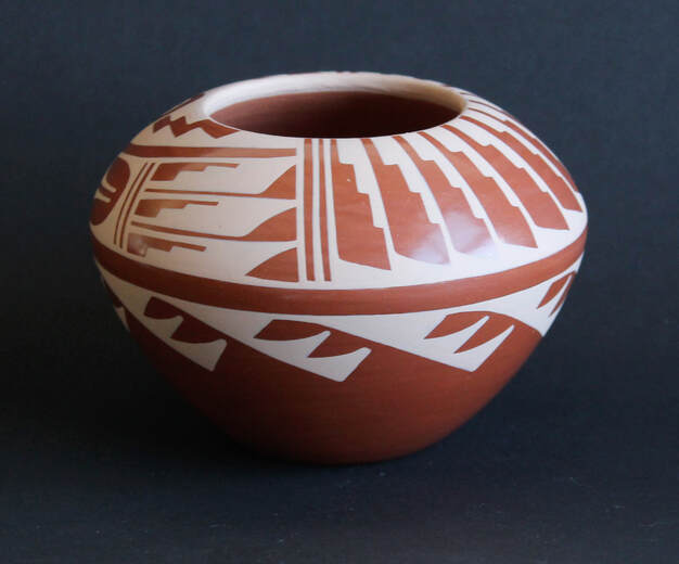
Unglazed ceramic bowl with inlaid slip (2001) by C.G. Loretto
In 2001 I went to live and work in the United States for a year. I was based in Los Angeles but I spent my Christmas in the beautiful city of Santa Fe in New Mexico. It is in a high desert region; for the whole of my stay there I had snow on the ground and piercing blue skies.
This is a traditional design of pot made by the local Pueblo Indians. The surface pattern is made with inlaid slip (liquid clay). Before the pot is fired, the potter scratches the design into the surface of the clay. Lighter-coloured slip is then brushed over the scratched areas. After it has been allowed to dry, the excess slip is scraped off, revealing the original design. Sometimes, as with this pot, the clay is then burnished (polished) to make the surface extra smooth and shiny. The pot is fired once and left unglazed. I love the design on this pot - I spent ages choosing it; Sante Fe and neighbouring Taos are full of shops and galleries selling pieces like this so I had plenty to choose from - and I like that it is unglazed: when I handle it, it feels like that adds to its fragility. And, of course, whenever I look at this pot, it reminds me of the really happy year I spent living in America. 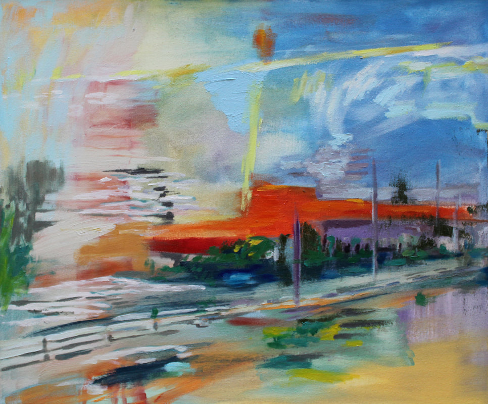
Oil paint on canvas (2019) by Ute Haring
I bought this painting from my friend and colleague Ute Haring. I saw it in an exhibition she had in a gallery in Blackheath. I feel very lucky to have it: Ute is rather fond of it and was initially reluctant to let it go; she gently tried to interest me in one of the other paintings in the exhibition. I have promised her that if she starts to miss it too much, she can have it back.
It is a semi-abstract piece based on a memory of train journeys the artist often made into and out of the city of Leipzig, her home town in East Germany. I love the colours Ute has used and the feeling of movement the image has, and the sense I have when I look at it that what I am seeing is a memory. 
19 APRIL 2019. Ian Russell
“One shall no longer paint interiors, people reading and women knitting. They will be people who are alive, who breathe and feel, suffer and love.”
Edvard Munch, 1889 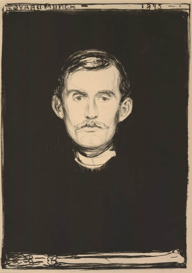
Self-portrait (1895). Lithograph on paper
Prior to this week, I’d been fortunate enough to see two major exhibitions of the work of Norwegian artist Edvard Munch (1863-1944).
His name, incidentally, is pronounced Mʊnk (with the ʊ sounding like the double-o in book, took, etc); definitely not as munch (as in the thing you do to crisps). And I think, although I’m not 100% certain, that the second d in Edvard is silent (I've listened to it several times on Google and I still can't decide if it's actually there or not). This week, I saw a third exhibition of Munch’s work. Whereas the first two (at the National Gallery and then the Royal Academy) focussed largely on his painting, this latest, brilliant show at the British Museum is mainly about Munch’s printmaking. 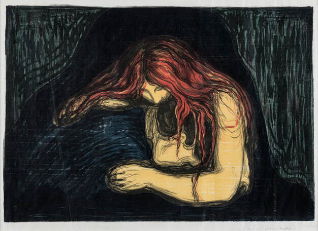
Vampire II (1896). Lithograph and woodcut on paper
Why does Munch’s work deserve attention?
Despite its potentially misleading name, European Modern Art, as a recognisable style/approach/attitude, started in the latter half of the 19th century. Munch was one of its early pioneers. In its time, his artwork was highly original and innovative, and eventually became hugely influential. His best-known image is probably The Scream, of which he created several versions, as paintings, pastel drawings, and prints. 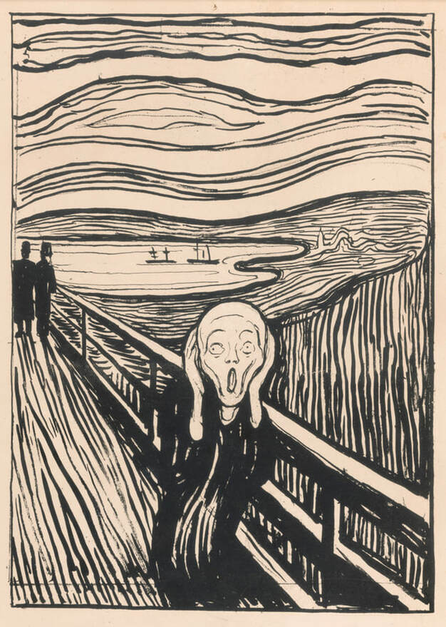
The Scream ((1895). Lithograph on paper
Munch has explained the inspiration for this piece. He was out walking with a couple of friends on the edge of a fjord, near the city of Oslo. It was around sunset and the clouds suddenly turned "blood red". At that point, Munch says, it felt to him as though there was an "infinite scream passing through nature". He could well be describing a type of anxiety attack. It's usually assumed that the central figure in this piece is screaming; that's probably not the case. His mouth isn't really the right shape; people normally show their teeth when they scream. According to Munch, it's the landscape that's screaming; the man on the bridge is just trying to block out the noise.
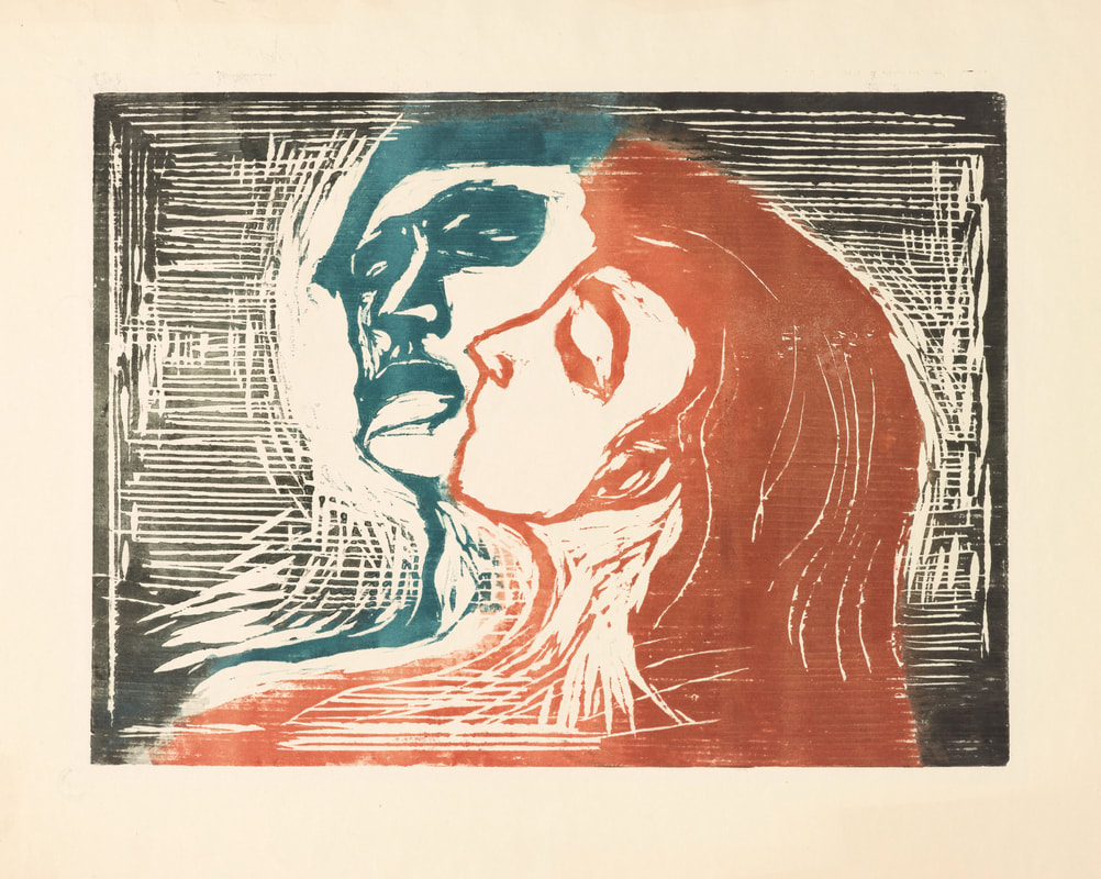
Head by Head (1905). Woodcut on paper
Munch was clearly an extremely good draughtsman; to put it another way, he was great at drawing. Most of the things in his compositions (such as bridges, buildings, cafe interiors, etc) are immediately recognisable, and in his portraits he always achieves a good likeness. You could, therefore, say that his work is figurative or representational. But Munch’s art is about much more than just showing us what people and things look like. Crucially, it's about expressing, or communicating, an often heightened emotion or state of mind. As the curator of the British Museum’s show puts it, “Munch’s idiosyncratic expression of raw human emotion reflects many of the anxieties and hotly debated issues of his times, yet his art resonates powerfully to this day.”
The Girls on the Bridge (1918). Woodcut on paper
This exhibition, entitled Edvard Munch: love and angst, is on at the British Museum (www.britishmuseum.org) until 21 July 2019. I would advise booking tickets in advance, and I thoroughly recommend that you see it! Parents with young children, though, should check that they are happy with the subject matter of some of the artworks on display.
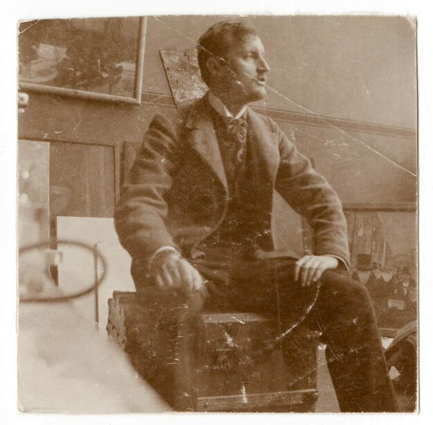
Edvard Much sitting on a trunk in his studio (1902)
26 FEBRUARY 2019. Ian Russell
“Certainly, colour had carried me away. I sacrificed form to it almost unconsciously.”
Pierre Bonnard, 1912 There is currently a major exhibition of Bonnard’s work at Tate Modern, the first such show for twenty years. Its full title is Pierre Bonnard: The Colour of Memory and it is on until 6 May 2019. It is a glorious exhibition. Bonnard’s canvases, of which there are many, are saturated with light and colour. The paintings are mainly of interiors – rooms in the various homes that Bonnard shared with his partner, Marthe de Meligny – and landscapes. 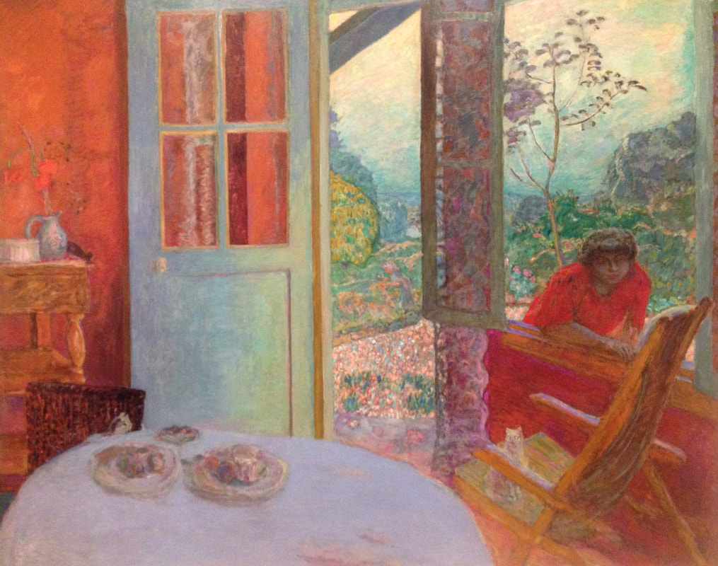
Dining Room in the Country (1913). Oil paint on canvas
Why does Bonnard’s work deserve attention?
In 1874, in Paris (which was then pretty much the capital of the western art world), a bunch of radical, avant-garde artists, led by painters such as Claude Monet, Edgar Degas and Berthe Morisot, held their first group exhibition in a photography studio in the Boulevard des Capucines. This group, who quickly became known as the Impressionists, revolutionised painting in all kinds of ways but in particular through the way they used colour. Their work led to more radical art being created by the next generation of painters such as Henri de Toulous-Lautrec, Vincent van Gogh, Paul Gauguin, Henri Matisse, and Pierre Bonnard. 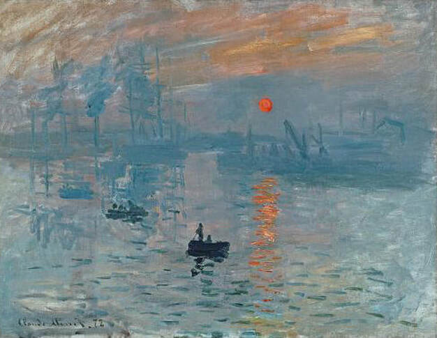
Impression, Sunrise (1872) by Claude Monet. Oil paint on canvas
The Impressionists were determined to find ways of doing justice, in their paintings, to the light and colour of the real world. Their innovations made it possible for painters like Matisse and Bonnard to go on to free colour from merely describing the appearance of a subject, to becoming a means of expressing the artist’s feelings about his/her subject. It’s as though painters like Bonnard looked at Impressionist art and thought, “Blimey! If colour can do that, let’s see if we can get it to do this!”
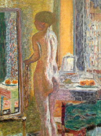
Nude in the Mirror (1931), detail, by Pierre Bonnard. Oil paint on canvas
Even though Bonnard’s pictures are of specific people and places (such as his wife, rooms in their home, their garden, the landscape around their house, etc.) they are not painted directly from life. Bonnard preferred to work from memory. He argued that “the presence of the object ... is a hindrance for the painter when he is painting.”
Bonnard’s colours are vibrant and shimmering. Much of the paint is layered – loosely painted brush strokes of colour on top of other sometimes competing, sometimes harmonising, colours. In that sense the colour is textured, but it is a texture that comes purely from Bonnard’s unblended, still-visible brushstrokes. The paint itself is uniformly thin; it has no physical texture, no impasto. Who has Bonnard influenced? There are a number of important contemporary painters whose work seems to demonstrate the influence of Bonnard. Here are just two of them: Peter Doig (born 1959), one of Britain’s most renowned figurative painters. Like Bonnard's paintings, Doig's images convey a sense that what we are looking at is not simply a picture of a place, but more a representation of a memory of a place and a moment in time. 
Swamped (1990) by Peter Doig. Oil paint on canvas
Lucy Smallbone (born 1988), painter of exciting, atmospheric and immersive landscapes. Lucy completed her Masters at the Slade School of Fine Art in 2015. Her work has won her a number of awards, including the Duveen Travel Prize, and in November 2018 she led a highly successful art workshop at SWPS.

River Light (2018) by Lucy Smallbone. Oil paint on canvas. www.lucysmallbone.com
13 APRIL 2018. Ian Russell
The typeface that I have chosen to use throughout this website is called Open Sans. I like it very much; I think it’s highly legible and has a rather pleasing, contemporary, under-stated elegance. It was designed by an American typeface designer called Steve Matteson. He studied at RIT (the Rochester Institute of Technology) in New York State. He’s 53 and lives in Michigan, in the US, with his wife, two daughters, and two golden labradors. I mention all this for two reasons:
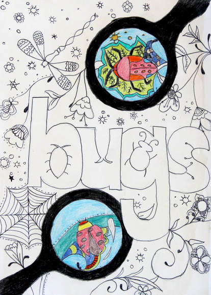
When my GCSE students (Years 10 & 11) study the work of contemporary and historical artists, they frequently demonstrate an interest in, and respect for, typeface design in the way they present the results of their research: 
There is a great deal that goes into the design of a typeface. Usually the aim is to make each letter of the alphabet work well alongside all the others. If the size, proportions, or weight of an individual character is slightly off, it will trip up the eye as it travels across a line of text. So, designing a typeface usually requires a huge amount of attention to detail. It can take months, or even years, to design a full alphabet. 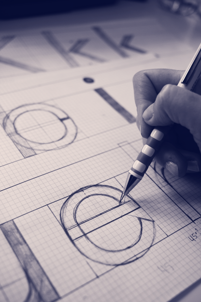
Picture by Amanda Mahoney-Fernandes (2015)
There are lots of ways of categorising fonts/typefaces (these days those two words mean virtually the same thing). The two broadest, and probably most commonly used, categories are:
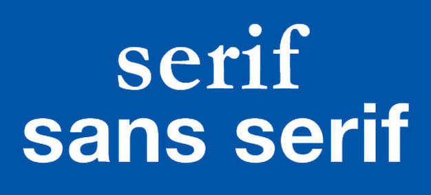
A serif font is a font whose letters have serifs – the points that stick out at the end of most of the characters. The word sans comes from the French word meaning without, so sans serif fonts are, literally, typefaces without serifs. The earliest example we have of a serif font is on Trajan’s Column, built in 113 AD as a tribute to the Roman emperor Trajan. 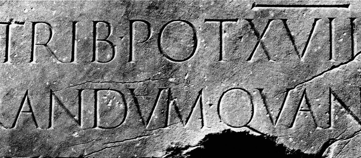
Picture courtesy of Codex 99 (2011)
In theory, because of the way serifs curve or reach out towards the letters on either side of them, they give words on a page a kind of visual fluidity that makes a line of text easier, more comfortable to read. This is probably why large bodies of printed text, such as you would find in the pages of novels, newspapers or magazines, are commonly set in serif fonts.
Body copy in serif font Financier, designed by Kris Sowersby. Financial Times (2014)
We tend to associate sans serif typefaces with a sense of up-to-the-minute modernity, but many of the sans fonts we use were designed quite a long time ago. A particular favourite of mine, for example, is the typeface Futura.
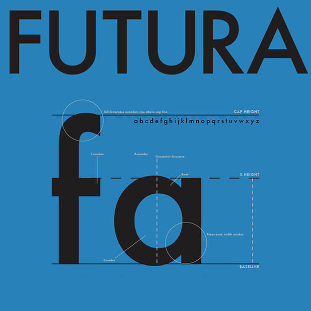
Image by Jeremy Peck (2016). www.jerepeck.com
It was designed in 1927 by German designer Paul Renner.
One of its distinctive features is that it has a circular letter o; the o in most fonts is more like an oval. Renner’s design, with its strong emphasis on geometric shapes such as the circle and the triangle, was almost certainly influenced by the work of the Bauhaus, a German school of design that has become hugely influential. Futura is one of the two typefaces we use in the SWPS Magazine. 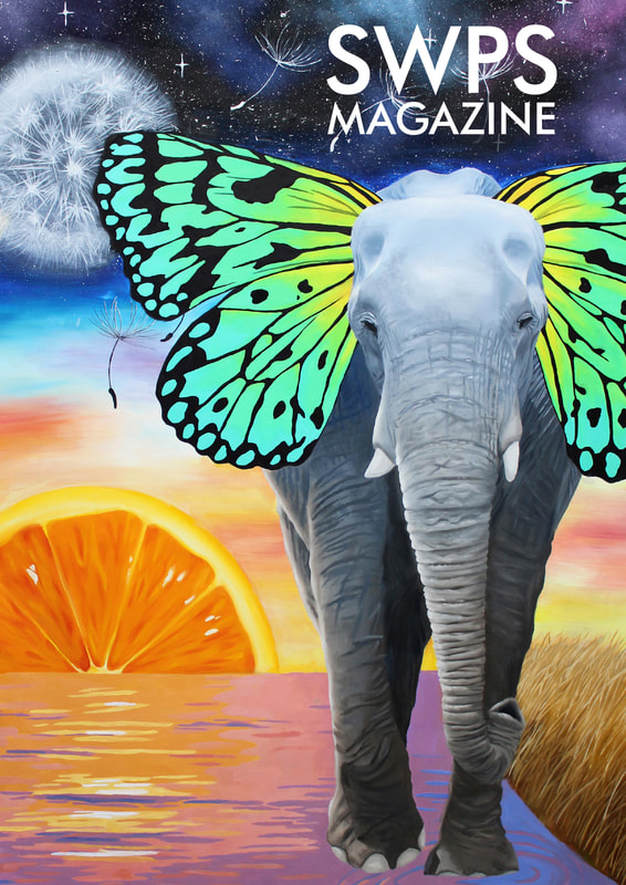
Cover artwork by Rhiannon (Year 10)
Further reading:
Just My Type: A Book About Fonts (2010) by Simon Garfield. Published by Profile Books. The Field Guide to Typography: Typefaces in the Urban Landscape (2013) by Peter Dawson. Published by Thames & Hudson. |